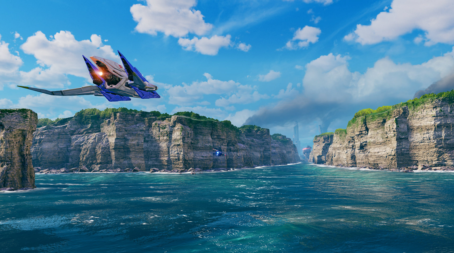
Corneria is the very first level and it was super important to set the tone for the game.
We wanted the players to have a very welcoming scenic vibe when they first play the game. On the first shot of the ocean and cliff, it hides majority of the city destruction until you get up close. I modeled and textured everything in the intro scene, composed, and adjusted the water(the tech artist made an awesome water shader that was great off the bat).
We wanted the players to have a very welcoming scenic vibe when they first play the game. On the first shot of the ocean and cliff, it hides majority of the city destruction until you get up close. I modeled and textured everything in the intro scene, composed, and adjusted the water(the tech artist made an awesome water shader that was great off the bat).
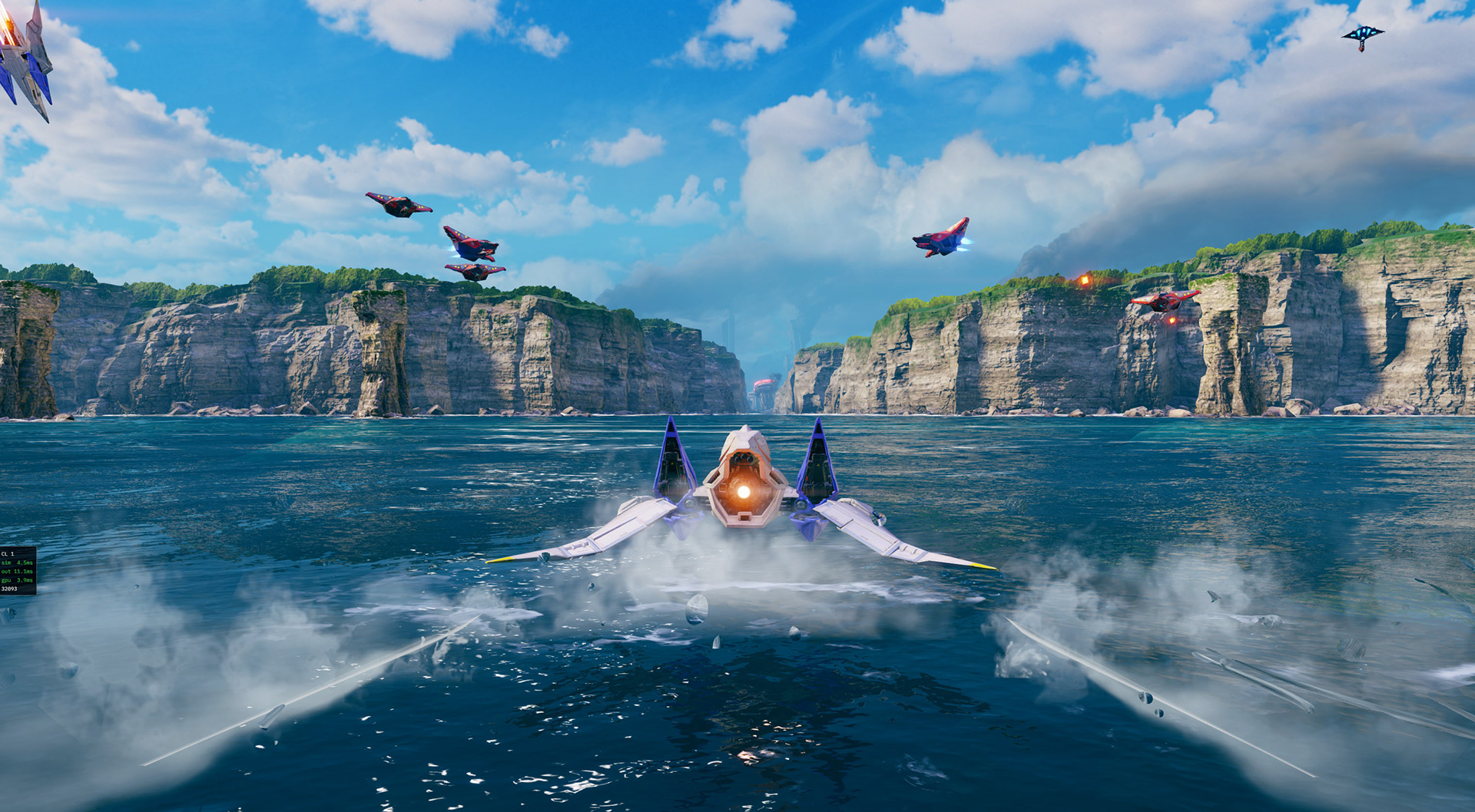
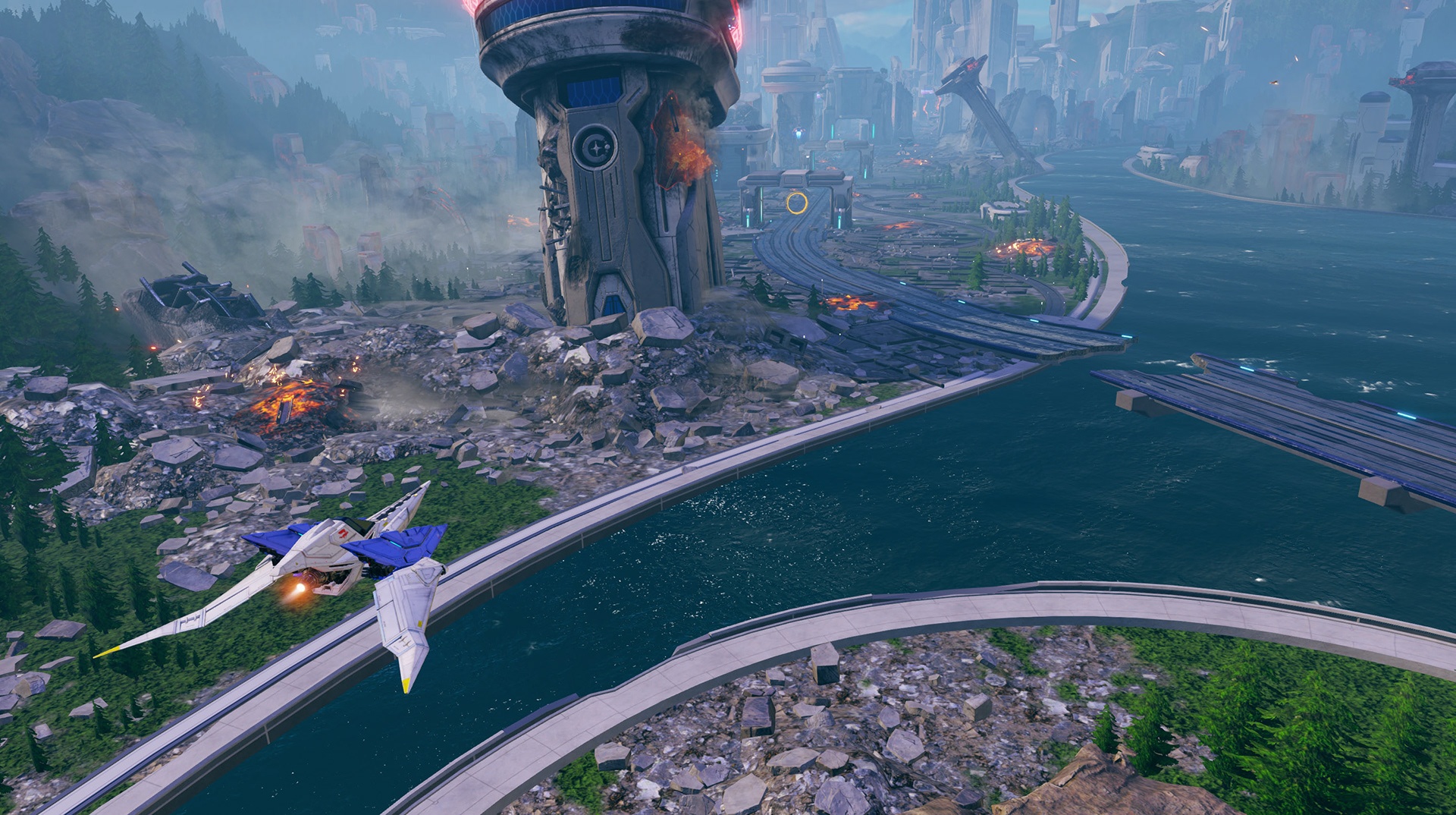
I composed the heart of Corneria battle while maintaining the original gameplay objects and pathways. Entering the city, I made sure the viewers eyes would always go to play area by tapering mountains and buildings down towards the center. I definitely preached hard on this idea to the environment team. Taper down but don't make it a straight line. Add variation of height and randomness so nothing really stands out. This way when we do want something to stand out for gameplay, the player can easily spot it. I made several assets in the scene as well.
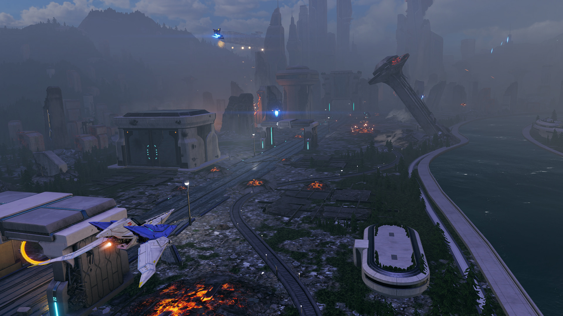
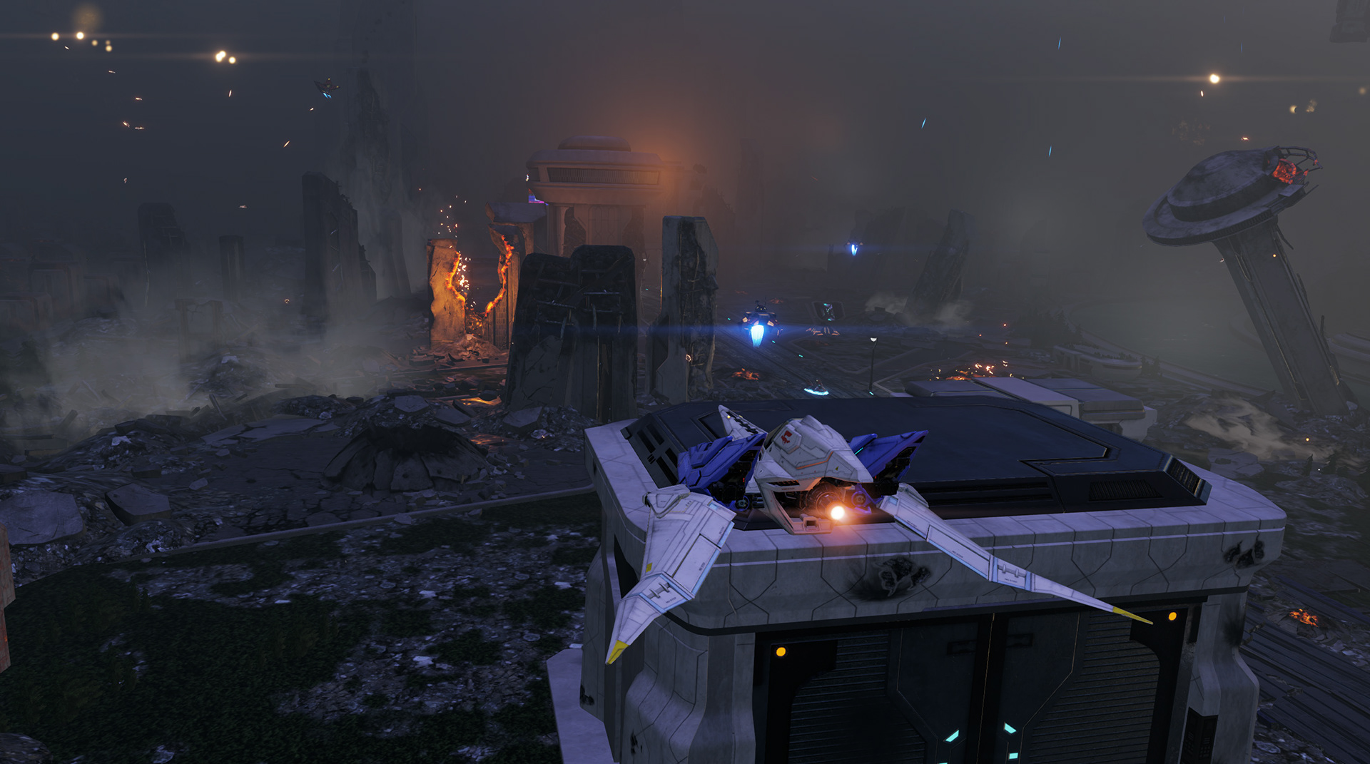
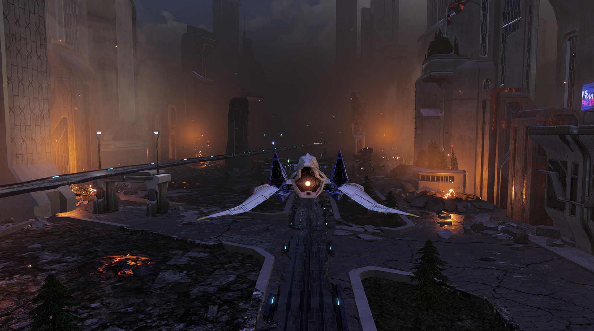
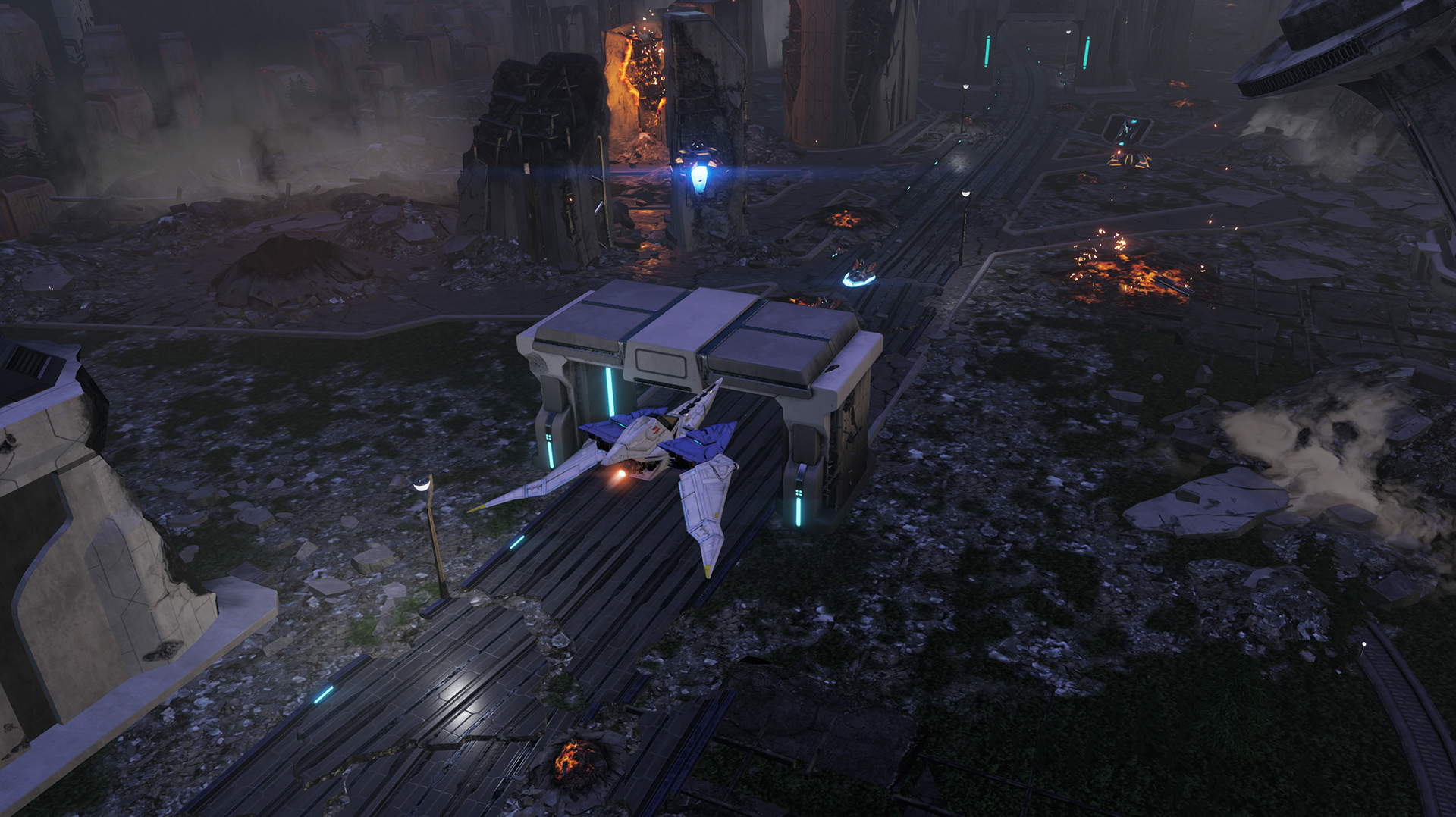
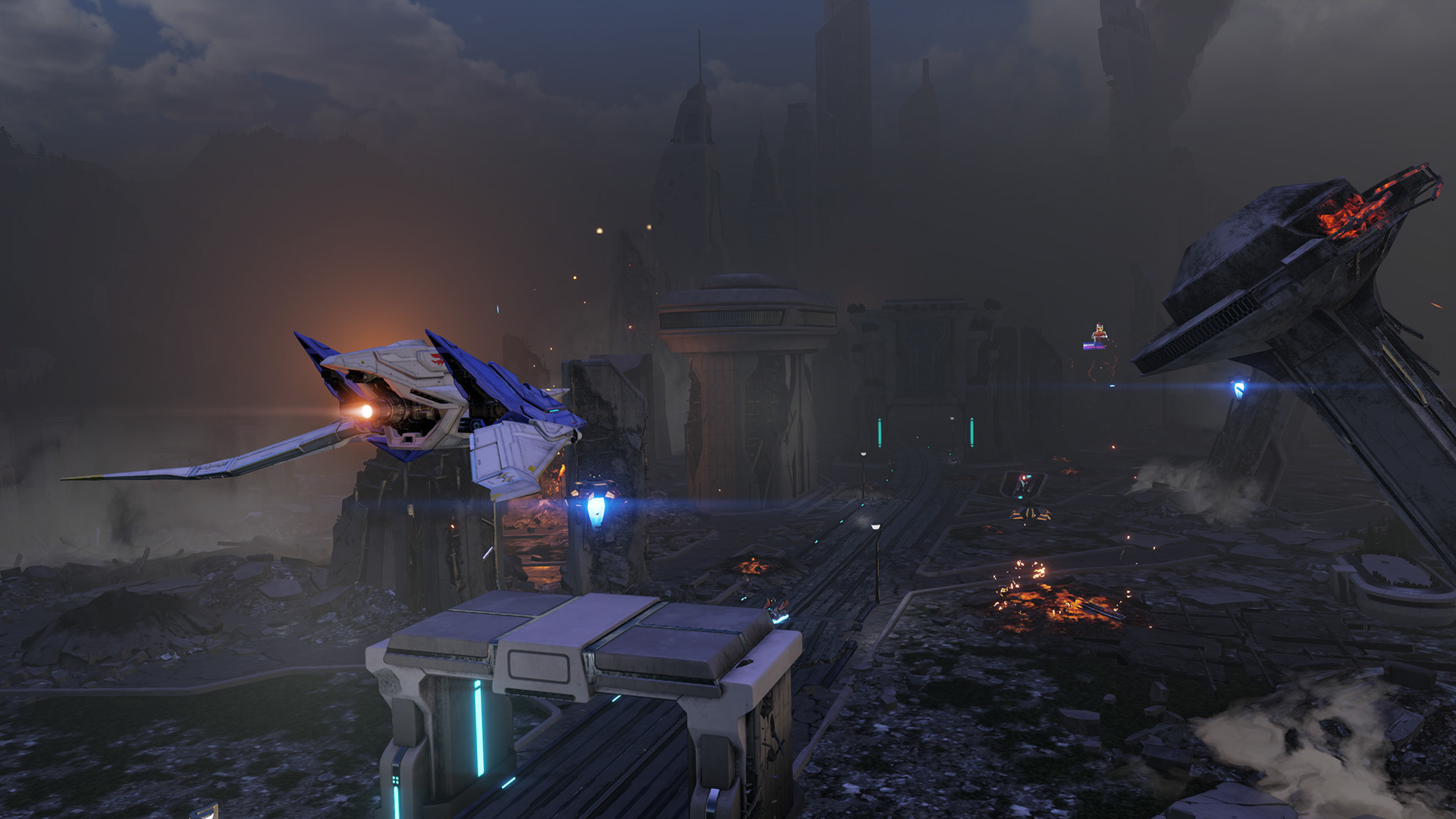
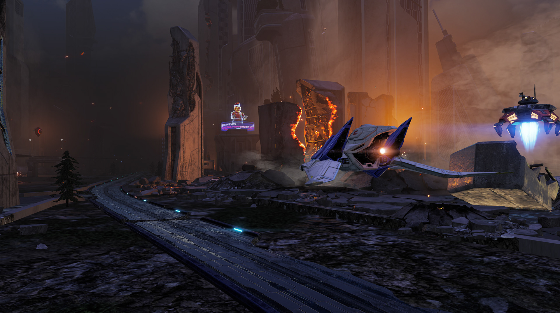
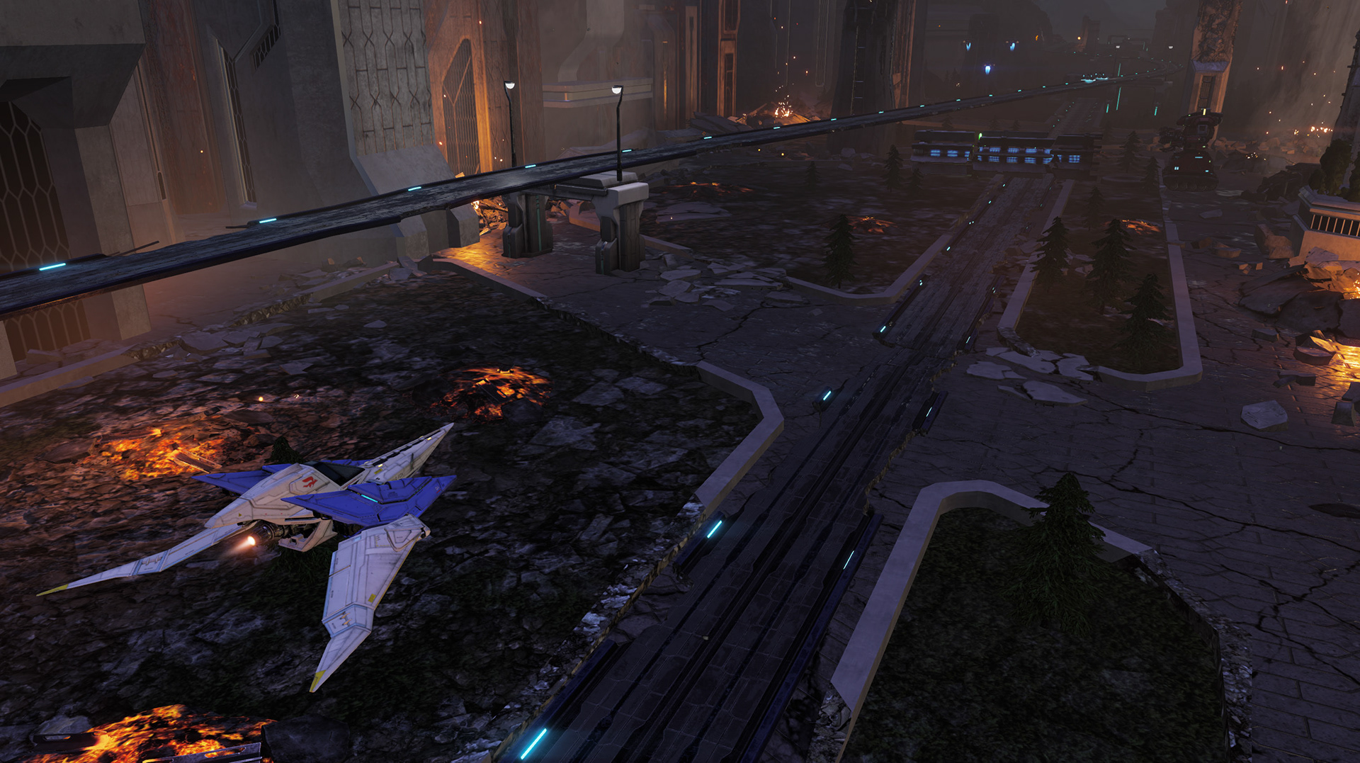
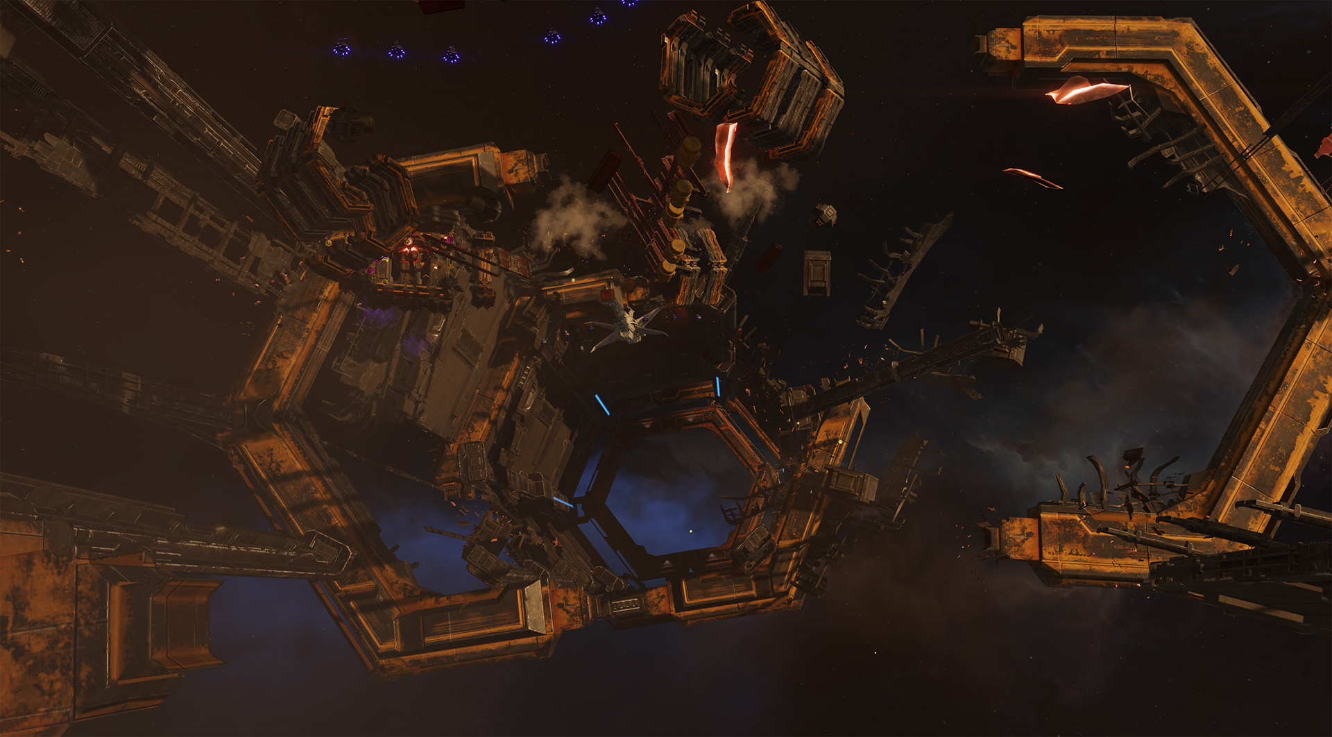
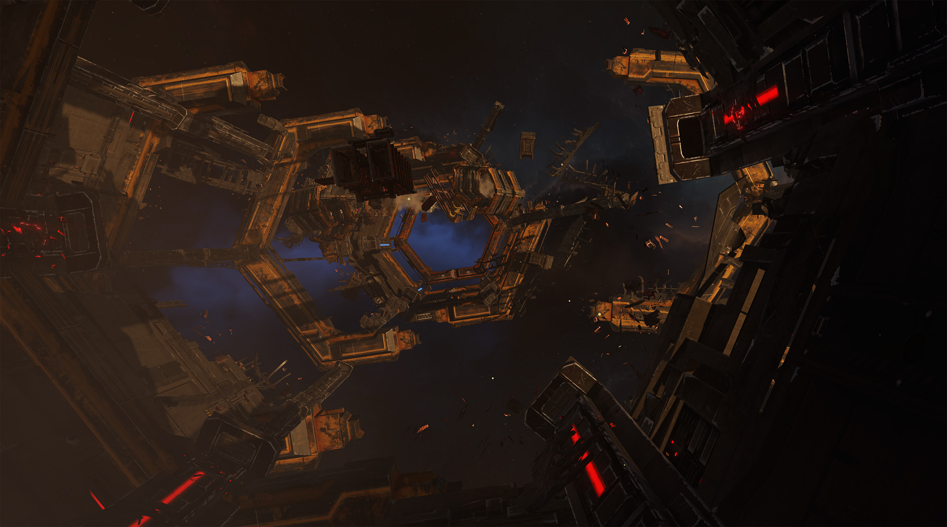
This is a multiplayer map that I made using assets from Sector X. I wanted the viewer to instantly know what kind of story this environment was telling. Hopefully the viewer sees that some kind of explosion happened and which direction it came from. I made sure to follow some design patterns like the hex from the single player to show it's connection. Obvious color scheme at both ends to help with player orientation. My part was two weeks of work.


The following environments are made by the talented team that I had the privilege to lead and mentor.
My role was to guide, teach, listen, and give extensive feedback of every expect of environment creation.
Composition, color theory, texturing, modeling, sculpting, optimization, balancing visuals vs perf, terrain creation, and how to guide the viewers eyes purposefully.
Some shots are highlighted to demonstrate environment principles.

Transition between the ground and any large object was a focus point for Titania. Using medium to small rocks to hide the polygonal line between the ground and large objects was very successful. It also acts as a direction for the viewer that leads back to the ground and play area.
The skull and bones went through many iterations. I guided Meagan to make it instantaneously obvious that it was very aged bone and skull. Using very cliche crack marks that goes down in the middle and how sharp the edges of the bones get as it ages. I think the artist did a fantastic job achieving our goal.
It was important to make sure all the large rocks and cliffs showed off the accumulation of sand. We worked hard to have a design language for these rocks and cliffs. I helped the artist on sculpting methods in zbrush and fundamental art design.
We worked on a beautiful corner first, which helped the artist with the design language for the rest of the level.


Two particular things we really focused on were the rocks and snow material. A lot of iterations were done on the rocks to make sure the snow on top felt right. People instantly know how snow things should feel and we had to make it obvious how the snow was piling on top. We only had to make few of the big rocks to form bigger ones or rescale them to make it feel just different enough.
The snow and ice materials cover a lot of the scene so it was important to spend time on them. One trick I learned in the past was introduce sparkle noise in the roughness map and it dramatically reduce its roughness. When the sun hits the ground, you get that nice sparkle as you fly by. We used this method on the snow and even above level Titania desert.
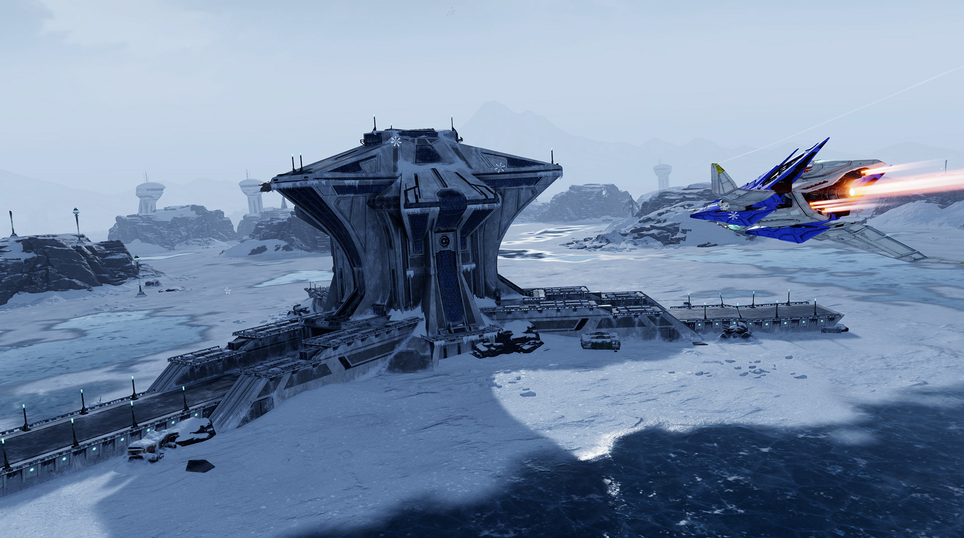
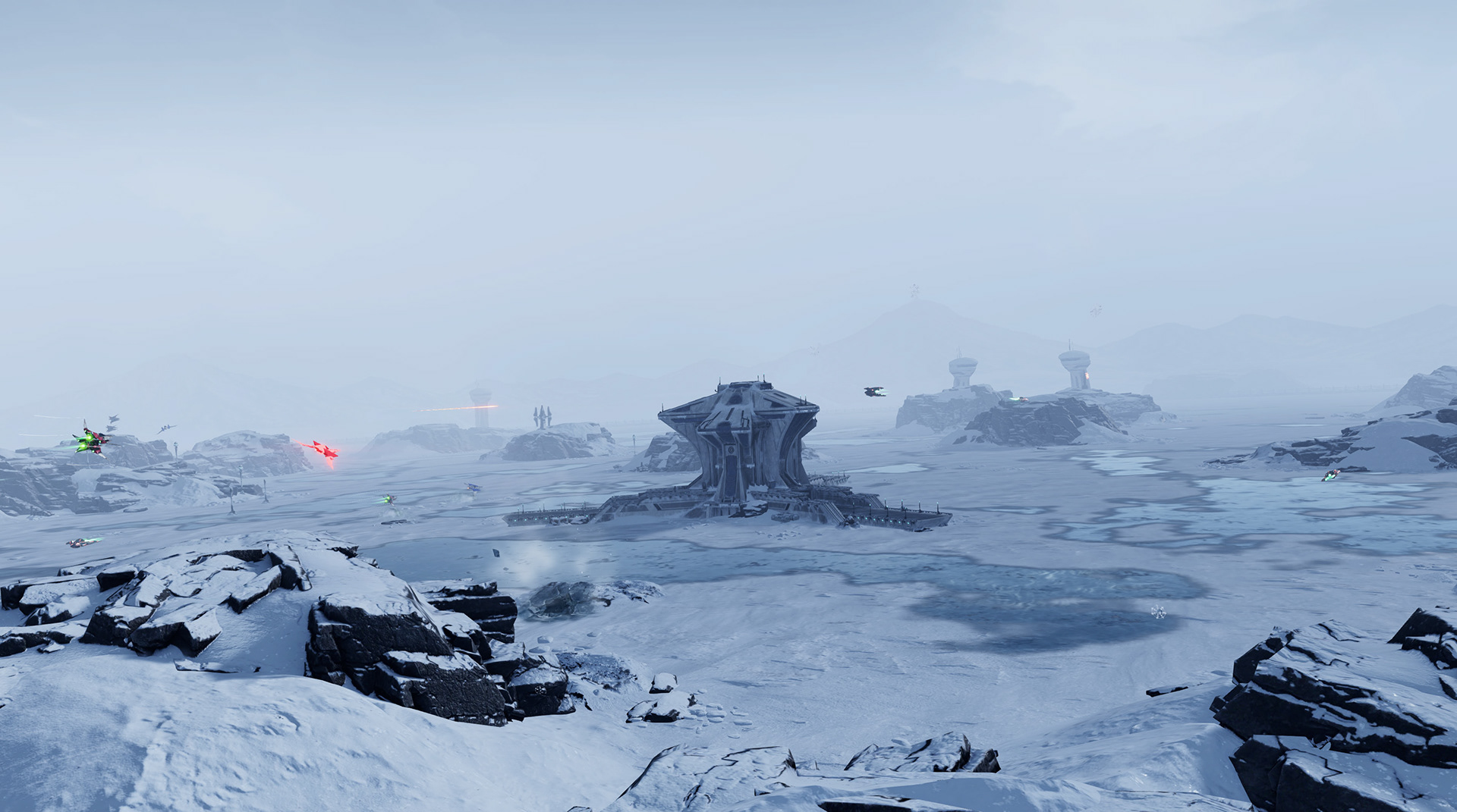

For this Venom level, I guided the artist to focus on two major things. Composition and transition. It was very important to have the cliff walls guide the viewers eyes back to the center. It was also important to make sure each side felt similar but add asymmetrical design to make it more interesting. The thing the team probably got tired of hearing me say is "treat this as if it was a painting."
The biggest lessons I taught wasn't how to create assets but showing them how to compose a scene like a painting.
There were clear geometry seams between the ground and the cliff walls, so having medium to small rocks helped it to make a smoother transition.
This was the artist's first terrain environment and plenty of time was given to test, fail, and succeed.
This was the artist's first terrain environment and plenty of time was given to test, fail, and succeed.
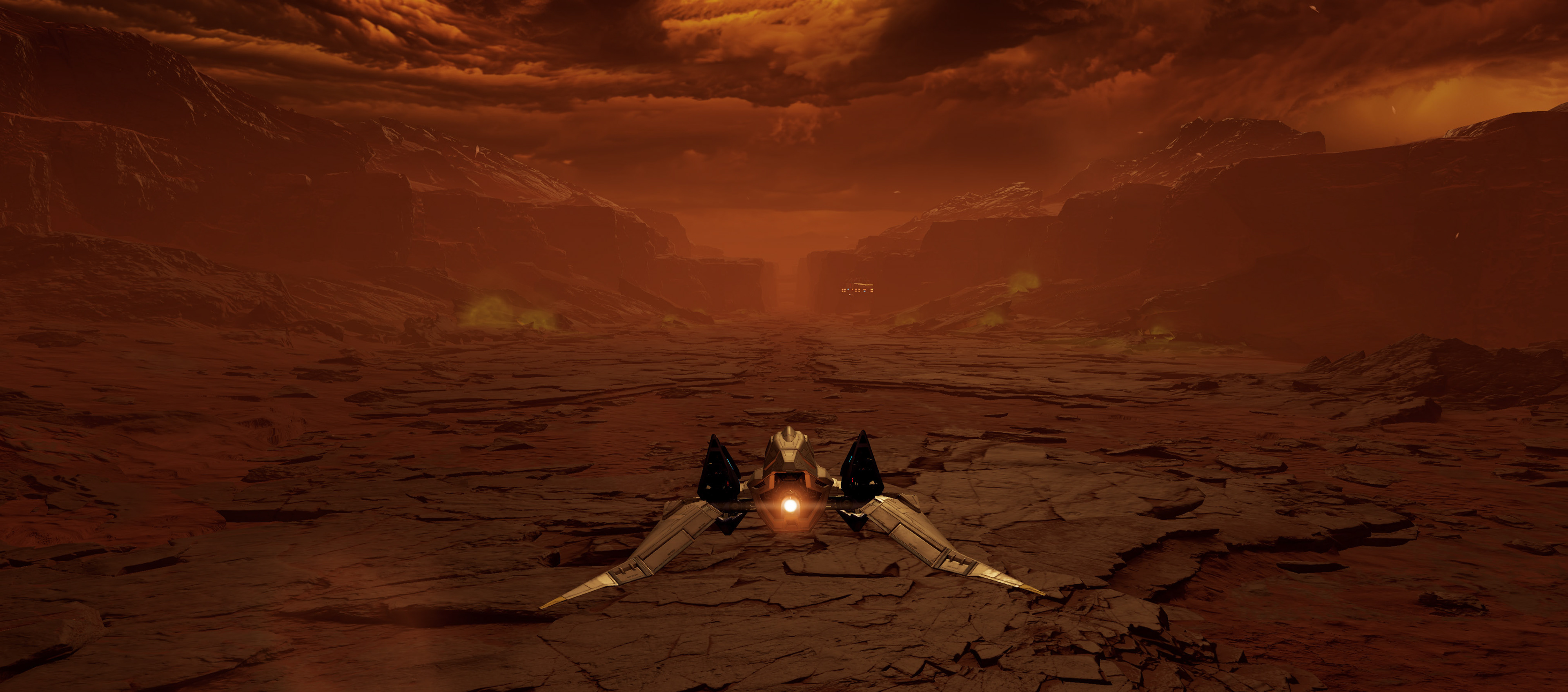


The same artist on Venom 1 worked on Venom 2. You can see the lessons from the previous level in full effect in this image. He did a great job drawing the players eyes from top right to lower left ground. Michael did a fantastic job on this level.

This level we also focused on breaking scene up into three sections. Foreground, mid level, and background. It was super important to make sure those three elements are present while having a smooth transition from front to back. I gave a lot of guidance on readability and composition.